- Published on
Crafting Cohesive Experiences: Building a Front-End Design System
- Authors

- Name
- Quinton Urquhart
Table of Contents
- What is Figma?
- Design Systems
- Prototyping
- Brand Guidelines
- Wireframing
- Home Page
- Header & Navigation
- Prototypes
What is Figma?
Figma is a cloud-based design tool that facilitates collaboration among designers, developers, and stakeholders. It is widely used for creating user interfaces, designing digital products, and prototyping. Figma stands out for its real-time collaboration features, allowing multiple users to work on a project simultaneously.
Design Systems
Figma excels in creating and maintaining design systems. Designers can define consistent styles, components, and assets, ensuring a unified visual language across the project. This is crucial for front-end development to maintain consistency and streamline the workflow.
Prototyping
Figma allows designers to create interactive prototypes. This feature is instrumental in simulating user interactions and testing the flow of a website or application before development begins. It supports transitions, animations, and user flows, providing an accurate representation of the final product.
Brand Guidelines
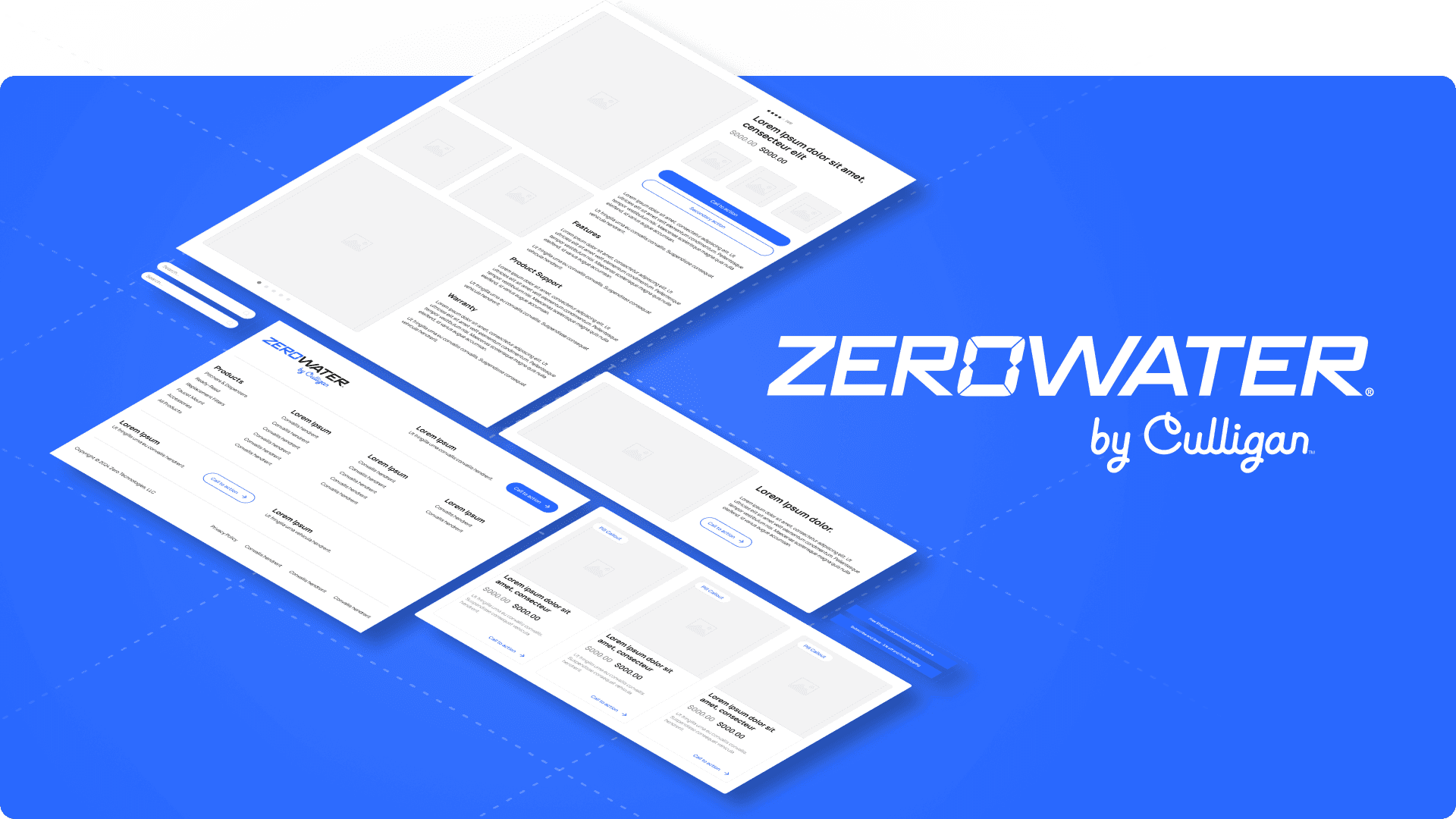
ZeroWater now has a very well defined brand guideline via Culligan. This guideline will be heavily leveraged when creating prototypes - eliminating almost all subjective reasoning in relation to fonts, colors, and in some cases layout. These guidelines have been adapted with aid from the greater marketing team to arrive at an in-between state in preperation for the Culligan Zero rebrand in Q1 2025.
Wireframing
I've pulled in all relevant keynotes from the brand guidelines and created color and text styles with them in Figma. From there, initial wireframes were built with a high focus on variable values.
Each HTML element type allows for font size and weight selection within bespoke components
Flex box and grid layouts have gap defined as variables that can be adjusted globally
Page and section layouts are determined by global variables for border-radius, padding, and gap
Home Page
A replication of the current ZeroWater home page was completed first. This provided a good base of components to work out the intricacies of this interconnected design system. Further improvements were made during the design process and base components were configured with variant properties for differing display types. This allows for simple instance swaps and ensures the design system well aligned to front-end development workflows.
Header & Navigation
I then moved on to the header and departed from the current ZeroWater UI completely. Reference was pulled from high performing e-commerce stores and layouts were built with pre-existing Figma components. The header and navigation are critical to overall user experience- engaging display of products and concise marketing copy have been identified as core tenets. The header element will receive highly focused data driven development post-launch and is likely to be the most complex element on site.
Prototypes
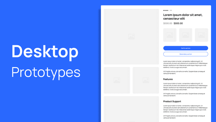
Desktop Prototypes - Figma
A link to view the in-progress design system prototypes for ZeroWater's headless storefront. Built in Figma, this file includes Home Page, Product Detail Page, Header, and Navigation prototypes.
Visit Now →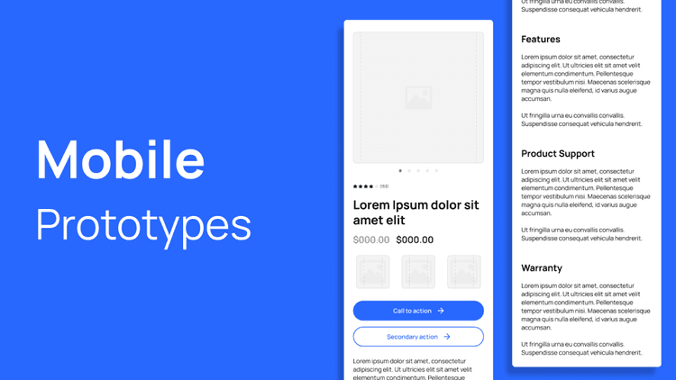
Mobile Prototypes - Figma
A link to view the in-progress design system prototypes for ZeroWater's headless storefront. Built in Figma, this file includes Home Page, Product Detail Page, Header, and Navigation prototypes.
Visit Now →